Featured Case Study
Markup Rebuilt
Modern annotation and feedback experience
Product Thesis
Feedback should happen inside the platform, not around it.
Review work lived outside the platform, creating friction and lost data. Markup needed to bring feedback back into Design Pickle.
Objective
Modernize a mission-critical proofing workflow
Annotations were one of Design Pickle’s most relied-on features, supporting the majority of creative reviews. The objective was to rebuild the annotation system into a scalable, intuitive, and consistent proofing experience.
Usage Signal
74% of all requests used annotationsProduct Goal
Improve clarity, review speed, and engagement
The redesign focused on making feedback easier to leave, easier to understand, and more consistent across asset types.
Problem
Legacy annotations created friction in the review loop
Design Pickle’s legacy annotation system was built on outdated technology with limited markup options, inconsistent behavior, and not enough flexibility for modern creative feedback.
Feedback was hard to place
Users had to draw a square around the area needing feedback, creating vague or imprecise direction.
Comments were disconnected
Feedback had to be typed in a separate directions panel, making context harder to follow.
Workarounds became common
Users left the platform to annotate externally, then re-uploaded screenshots and marked-up files.
The experience created unclear feedback, inconsistent quality, and longer turnaround times.
Research & Insights
High usage was not translating into efficiency
User research, platform analytics, feedback submissions, and competitive analysis showed that annotations were mission-critical, but the legacy experience was limiting workflow quality.
Annotations feature
74% of all requests used annotationsExternal markup added work
Designers received externally marked-up assets, adding extra steps and complicating version tracking.
Confusion increased support drag
Customer Success flagged annotation confusion as a common driver of user experience issues and back-and-forth revisions.
Competitors set a higher bar
Modern proofing tools offered richer markup systems and more consistent interactions across formats.
The opportunity was clear: users needed a unified, intuitive, in-platform proofing experience that matched how creative teams work today.
Solution
Modern canvas engine. Custom product UI.
Instead of rebuilding annotations from scratch, we adopted Fabric.js as the canvas foundation and layered a fully custom UI on top, delivering a faster, more stable, and more intuitive proofing experience.
Technical Foundation
Fabric.js
Provided modern drag, resize, rotate, and edit-in-place interactions through a mature, supported canvas library.
Custom UI
Native-feeling review tools
We designed a simplified toolbar, clear interaction cues, and unified behaviors across static, video, presentation, and multi-page assets.
Asset Consistency
One experience across formats
Whether users annotated a JPG, PDF, presentation, or video frame, the experience became predictable, consistent, stable, and familiar.
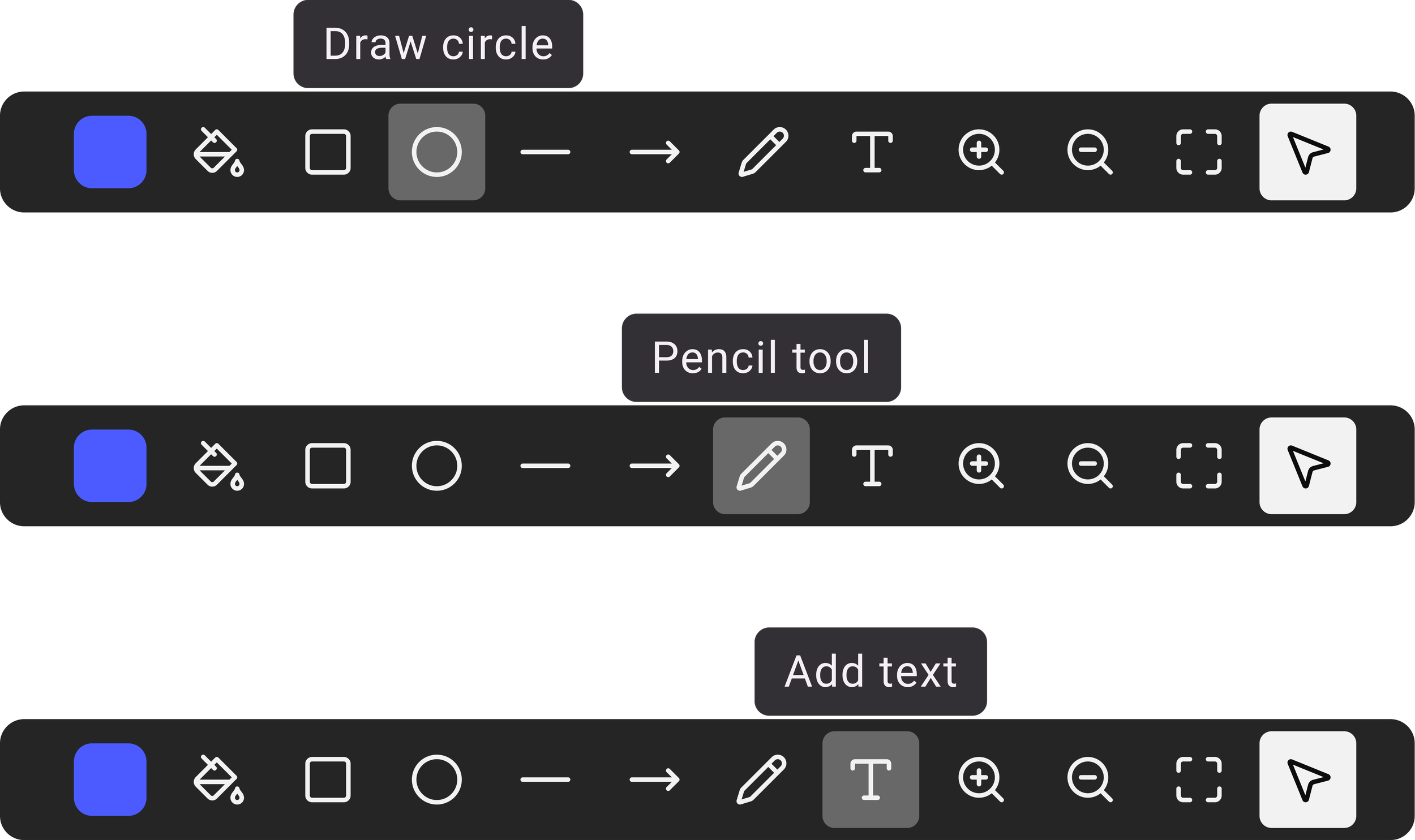
New Review Flow
Tool selection → markup → comments
Select a tool
Choose from clearer markup options that match modern proofing expectations.
Mark up your asset
Place feedback directly on the creative with more accurate, intuitive controls.
Add comments
Keep notes, threads, and visual context connected inside the platform.
Full UI Experience
A complete in-platform proofing workspace
The final experience brought visual markup, comments, threads, and asset context into one connected workspace.
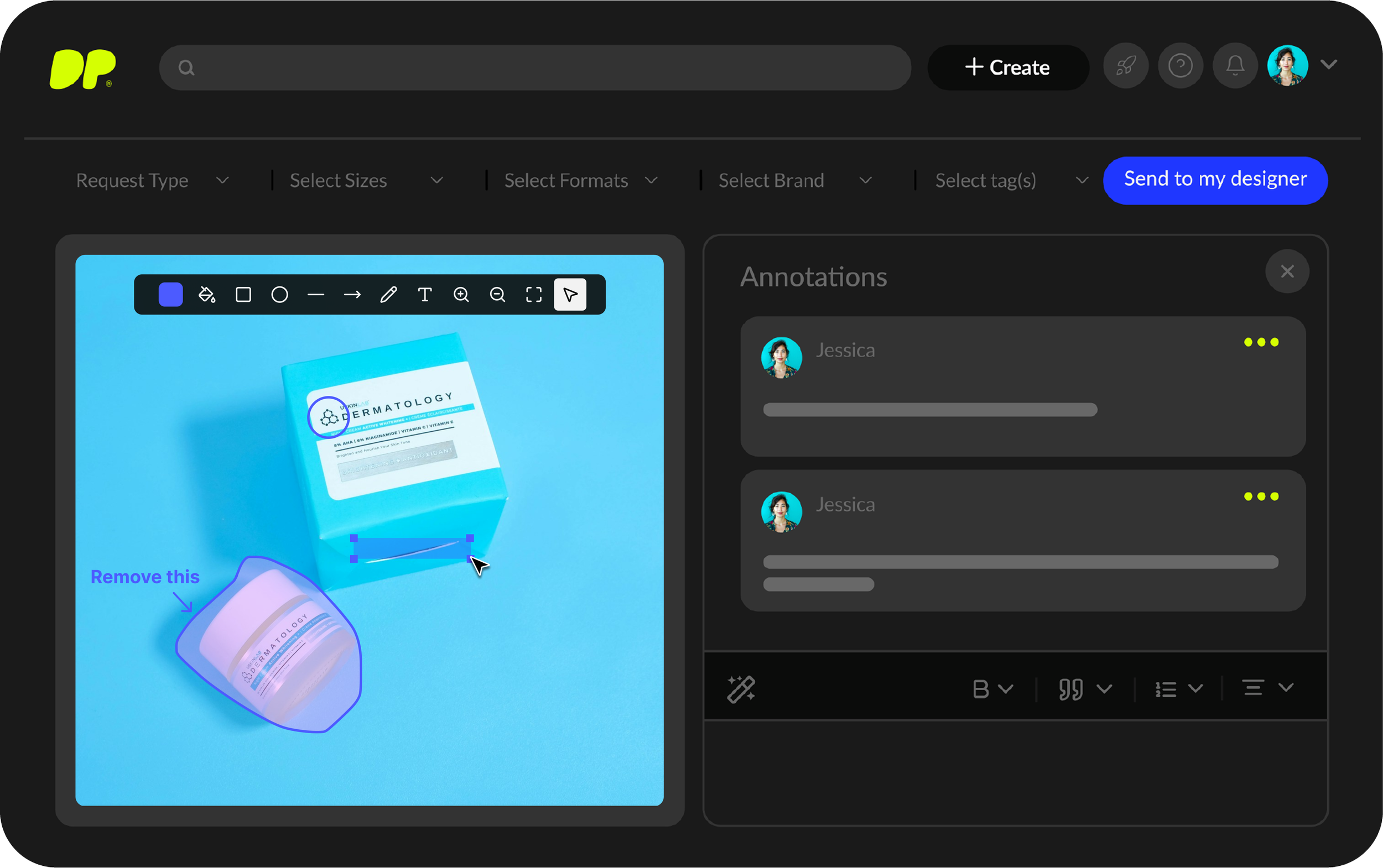
The solution reduced cognitive load, improved review consistency, and created a scalable foundation for future proofing enhancements.
Data & Outcomes
Modernization increased engagement across every major usage metric
Following the rollout, engagement and adoption increased across feature clicks, unique visitors, engaged accounts, and account adoption.
Usage in first 30 days
18.4K feature clicks, +200%The redesigned experience boosted platform activity, improved interaction quality, and strengthened product value for both new and returning customers.